Logos
#LogoDesign #Minimal #BrsndIdentity
#LogoDesign #Minimal #BrsndIdentity
I primarily handled outsourced logo design projects during my internship at a Korean design company.
![]()
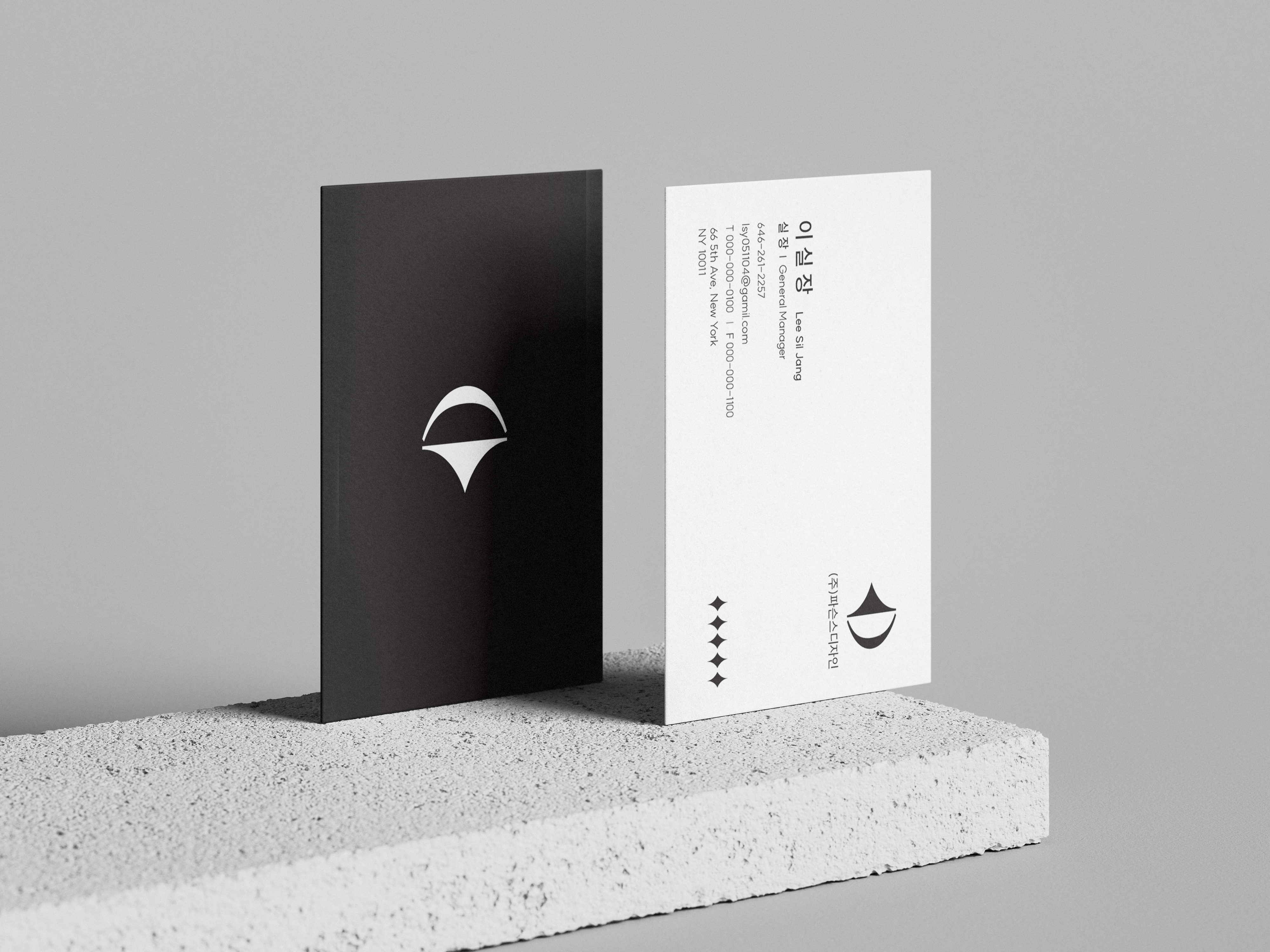
The first logo was created for the design company where I worked.
It incorporates the "Gam"(☵) trigram from the Taegeukgi, which represents water, symbolizing the company's cision of expanding globally lie flowing water.
The second logos was designed to reflect the company's initials and its core values, respectively.
The third logo was designed by combining the initiaols "H" and "D" of Haedam Industrial Development in a balanced composition. This design reflects the company's emphasis on both the aesthetics and structural balance of architecture.
All three logos were selected and later applied to business card designs.